Aris Clinic
Reinvigorating a Healing Brand
Aris Clinic is a behavioral and mental health clinic dedicated to helping kids, ages 5–18, return to healthy, stable and productive lives. Van Santen Studio redesigned their logo and brand identity to be more approachable and upbeat, while visually reinforcing the message of hope and healing.


Old Aris logo (left) Redesigned Aris logo (right)
Following interviews and marketing strategy development, Van Santen Studio created a logo is friendly and approachable, yet, not overly child-like — appealing to older children and adults in their lives. The leaf icon symbolizes hope, growth, and possibilities. The multiple layers within the leaf represent an integrated and innovative approach. The earthy color palette is calming, yet vibrant and youthful.
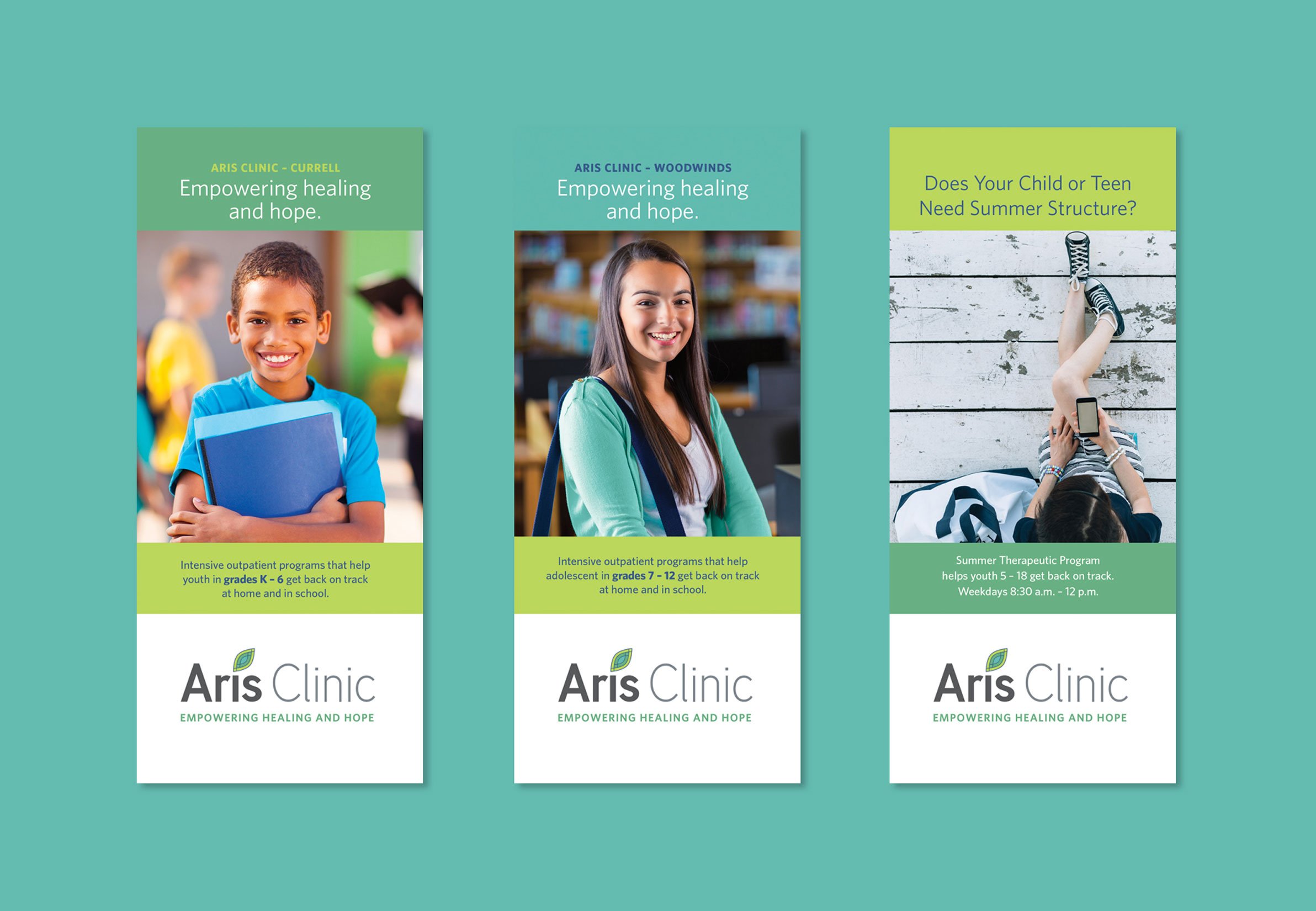
WORK INCLUDED Creative Direction, Branding, Web Design, Print Advertising, Email Design, Collateral Design, Exhibit Graphics, and Social Media Graphics
IN COLLABORATION WITH long-time partners and marketing strategists at Activated Growth.

With a deepening relationship and on-going conversations, I learn many inspirational stories. One of those stories is the wall of handprints. Each time a child or adolescent completes the program, they put their hand print on the wall. It’s a powerful message to the kids and their families, “Healing and hope happens here.”
I created a series of handprints to be used alone and in combination throughout the marketing materials as a reminder. When Aris Clinic celebrated their 10th year anniversary recently, I knew the two handprints should be integrated into the 10-year icon. Punctuating it’s own achievement and giving everyone a “high ten”.